Tag Archives: layout

Getting physical: Gawain panels and style

Jacksons wooden painting panel framework
Jackson’s wooden painting panel framework

Well, the wooden panels for my Sir Gawain and the Green Knight series came from Jacksons the other day, and very nice they are too. Smooth, well framed and surprisingly light for their size.  I’m now the proud owner of two 12″ square and four 12″ by 16″.


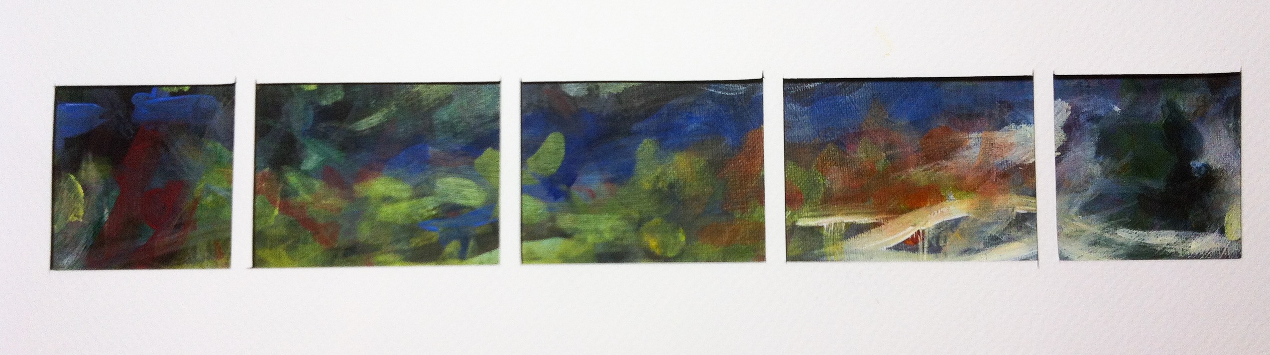
But before I crack on and get smothered in acrylic gesso, I’m painting a related 18″ by 24″ canvas in acrylics as a trial to inform my approach to the main panels. At the moment it’s all still too tight and pernickety – the small study on the left is closer to the feeling I want to get.

Sir Gawain's wildwood journey
Sir Gawain’s wildwood journey
Gawains wildwood journey
Study for Gawain’s wildwood journey

Rubbish photo by the way – I’ll post a better one at some point when I can actually get to see it in daylight.

There’s a long way to go yet. See that cunning fox? Well it won’t be so easy to spot once I’m done with it.

Sir Gawain journey end panel
Sir Gawain journey start panel

I have made a start on rough sketches for the two 12″ by 12″ end panels representing the start and end point of Sir Gawain’s journey to the Green Chapel. These will be linked by three or four 12″ by 16″ panels. The intention is that each panel should both work on its own and together as part of a greater whole.

Sir Gawain’s journey is not a comfortable one, and I thought that my painting journey should likewise take me out of my comfort zone. Not into flesh-flensing, tooth and claw battles with wolves and woodwoses you understand; no, I was thinking more stylistically (besides, all that fighting malarkey sounds far too much like hard work!)

I have considered a few options, and the panels would really lend themselves to a stylised narrative aesthetic as seen in paintings by Dee Nickerson and Sarah Birdie Fincham. I really love the work of these excellent artists and find both sublime, but sadly I don’t think I yet have the sensibility to work in a similar manner.

Recently I came across the multi-media work of Lisa Henderson. Her rich landscapes are gorgeous, and I could see a similar treatment working really well with Sir Gawain’s journey.  You can currently see her exhibition ‘Staffordshire Landscapes, a personal view’ at the Shire Hall Gallery in Stafford until 9th March.

Despite these tempting options I continue to be drawn to a heavily  textured expressive approach bordering on the abstract. Kurt Jackson’s work has always been a great inspiration to me – he squeezes so much soul into his sea and landscapes. They’re achingly beautiful, and the style’s far enough out of my comfort zone to make me sweat, so maybe I’ll head down that route, maybe…

Sir Gawain: panel layout with acrylics

Ah well, not all my ideas work well the first time round. For my main Sir Gawain cycle of paintings I’d always intended to knock up a rough, small-scale test piece to see how the colours might flow through from one panel to the next.

In my mind I see a subtle underlying chromatic progression from Sir Gawain in the red corner (his shield is scarlet) to the Green Knight in the green.  So on a piece of A3 Cryla paper I roughly under-painted in acrylics with Viridian on the left running into Alizarin Crimson on the right. Over these I used diluted Mars Black to create darker bands of tone.

Underpainting for rough Sir Gawain layout in acrylic

 Working with the Viridian as an underlay for Sir Gawain’s side (as a compliment to his scarlet shield and gold apparel), I roughed in three rough bands in colours roughly approximating to the seasons – spring on the left, winter to the right.

Rough acylic colour spread for Sir Gawain painting

On top of these I wanted to super-impose my scale panels but realised I hadn’t made a decision how big they should be.

Now, in the part of my mind that wanders off and gets very excited very quickly I’d always had a vision of a row of enormous panoramic panels, mounded with crusted, heavily textured paint… unfortunately the duller more down to earth bit woke up and chipped in with all sorts of practical reasons why I couldn’t actually do that; spoilsport!

Truth is I haven’t got a huge studio space where I can lay everything out at that scale, let alone work on it.  I was also concerned that it might be so large that I might not actually finish it! And if I did finish it I wouldn’t have enough wall space to display a mammoth work either. You can tell I’ve really thought this through…

So begrudgingly, like a toddler being denied a huge ice-cream, I pouted, shuffled and scuffed my feet and mentally shouted ‘not fair!’ and set about scaling my ambition down to do-able proportions.

I reckon two 12″ by 12″ end panels and three or four (still not decided) central panels 12″ by 16″. As wooden panels have an appropriate resonance I’ll soon be pinging an order to the good folks at Jacksons.

With the size settled, I cut a mask out of stiff white paper to a scale of 4mm to 1inch, like a row of little windows to represent the panels in their final order. This I overlaid onto my rough colour test.   By trying different positions I came up with these:

Rough panel layout mask 1 over acyrlic Sir Gawain painting


Rough panel layout mask 2 over acyrlic Sir Gawain painting


To be honest, a little disappointing and underwhelming. Although the second holds a certain obscure promise I really need to go back to the drawing board.  The tones are too similar and the colours don’t carry the variety I’d like.

I suppose if everything always worked first time we’d never learn anything would we?