I always look forward to my visits to Cornwall, it really feels like a second home now. This time we’re celebrating my wife’s ‘big’ birthday, so we’re here for three whole weeks. We’re about to go into our third week.
It’s not meant to be a painting holiday, but I’ve brought my plein air kit anyway! Oils this time rather than my usual acrylics.
To be honest, since we arrived on the Lizard Peninsular from our first week on the Isles of Scilly the weather hasn’t been exactly clement. A succession of storms have passed through, including a spectacular one at three in the morning which was more than biblical in proportion. Thunder and lightning accompanied by the most severe torrential rain I can recall seeing. Not good.
So in between relaxing as a family and dodging the weather, times to set up and concentrate on painting have been relatively few. I have sketched a little, but not very much.
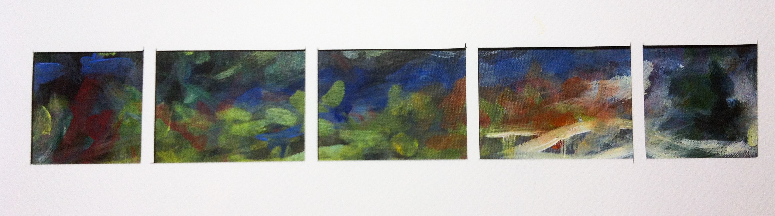
The paintings
Here are my three 8” by 10” efforts in oils to date. The first is a view from our cottage garden. I’ve moved a few things round, but I’m still not that happy with the composition. The second is in one of my favourite spots on the Lizard, Poltesco a long abandoned serpentine works. And the third is a roundhouse from the 16th century on the road to Church Cove.
It’s been very restful using oils again. So much more time to think about colour mixes. Acrylics are very unforgiving. Turn your back and they turn into an immovable solid lump of plastic on the palette and brush. It’s nice to be able to take the generous time which oils allow.
Hopefully I’ll get a chance paint some more in the last week of our holiday. If I can, great, if not, oh well, the holiday comes first.
Remember, my FaceBook page is often updated first with snippets and odds and ends.
With my studio still stuffed full with boxes of stuff from my late Dad’s estate, apart from making occasional sketches I’ve not been at all productive over the past 18 months. I completely underestimated the sheer physical amount of personal material I’d have to pick through and the ongoing, negative emotional impact that would have. In truth, I’ve had neither the time nor inclination to get stuck into anything very much.
A new pet portrait commission…
Before I completely filled the studio, early in the year I started a new commission in alkyds, a pet portrait of a gorgeous Italian Spinone dog. As I needed to work from photos I’ve found my iPadPro remarkably useful, being able to zoom in and adjust the lighting to reveal structural detail at will.
At the moment this is on hold with my client’s blessing, but it is close to completion. Unfortunately at 70cm by 100cm it is rather large, and I’ll only be able to finish it once my studio’s clear again.
…and a Cornish break
At least my June holiday gave me time to settle and sketch. Here are a few 6″ by 8″ acrylic sketches from my visit to the Lizard peninsular in Cornwall.
And I’m off again in September. First to the Isles of Scilly for 1 week and then the lizard again for 2 weeks. A three week holiday! I won’t want to come back! My plein air kit will go with me of course. I’m still undecided whether to take oils instead of my usual acrylics. So many advantages including extended drying time and retention of brush strokes. But after a few trial runs in the garden I really need to brush up. I seem to be very good at making panels of mud!
With things as they are at the moment it’s a lot less of a faff for me to upload a post to Facebook and Instagram than this blog as I can easily do it on the fly from my phone. So, if you’d like to see more frequent updates, please head on over and like my FaceBook page.
Ever since I was sent samples last year, I’ve been meaning to give Jackson’s Eco watercolour paper a proper trial. The textures are lovely, and I was really attracted by the heaviest extra rough paper. So I ordered a 22″ by 30″ sheet.
Before getting onto the paper, a word about the packaging. My lonely, solitary sheet came flat in a polythene bag in a huge box which was then stuffed with bubble packs. Honestly, it was a shame to unwrap it. Well done Jacksons.
Lovely texture
When I eventually reached the paper it felt exciting in the hand; so tactile. I could imagine it would work really well as a base for a super large, rough water seascape, especially with the decal edge and warping preserved. Sadly, my watercolour confidence doesn’t stretch quite that far!
About 3mm thick
Physically, this has to be the thickest ‘paper’ I’ve ever come across. It came out fairly consistently between 2.5mm and 3mm thick. To be honest, at 560lb weight, calling it a paper is stretching the description a bit. To my thinking you should be able to fold a piece of paper with ease. That’s really not going to happen with this product. I think it would be fairer to call it a textured watercolour board. Semantics aside, for me the fact that it is so very solid appeals. It should be ideal to take out a set of small boards on a painting trip with no need to stretch or mount.
On delivery the paper is in a naturally ‘wibbly-wobbly’ state. Whether you paint straight onto it and allow the paint run as dictated by the random undulating troughs and peaks, or whether you flatten it is entirely a matter for personal preference. I prefer a flatter surface. So I sprayed both sides of the paper with water until just damp, sandwiched it between paper towels and laid a heavy slab of granite (a kitchen cutting board) on top. After a couple of days it had set nice and flat without altering the texture.
According to Jackson’s description the paper is handmade in India, and looking at it, I’m pretty sure it’s unbleached. Comparing it with my favourite watercolour paper, Saunders Waterford, it seems ‘greyer’, a little darker and cooler in tint. I did wonder how any highlights might play out.
It’s not immediately obvious whether the paper is sized both internally and externally. Washes seem to rest on the surface for a while before sinking, and I’m guessing that it is surface sized.
Doesn’t tolerate masking tape
I often use low tack masking tape around my watercolour sketches to leave a clean white border, but I thought the surface of the Eco watercolour paper felt a little soft. Ignoring the obvious difficulty of defining any sort of clean edge over such a heavy texture, I tested it anyway. Sure enough, the paper stuck firmly to the tape and the surface tore free as the tape was removed. Not sure whether the same would be true of masking fluid. As I seldom use it, I didn’t try it here.
Chun quoit in acrylic
For my first painting I recreated an acrylic painting of Chun Quoit in Cornwall which I’d donated to #twitterartexhibit. After an initial coat of orange (Quinacridone Red and Cadmium Yellow) I worked the painting by scumbling undiluted paint across the surface, catching the highlights and sometimes working the paint deeper into the cracks and crevices. I really, really loved the paper for this way of working. So rich and vibrant, I got lost in the process. You can watch a time lapse video of the two hours it took to complete the painting.
Sketch of my cat, Ziggy
For my second painting, I made this quick sketch of one of my cats in pure watercolour. I’ll be honest, I didn’t find it as easy as my acrylic effort. At room temperature (18-20C) heavy washes took a good 20 minutes to dry, and often remained damp beyond this. And, as the painting progressed, I think the sheer thickness of paper acted like a reservoir. If you want to work onto a dry surface this may be worth bearing in mind. Ironically, the texture which so attracted me when using acrylics, proved a little intimidating when I switched to watercolour.
For me, the bare paper highlights appeared rather muted, giving the whole a quiet aspect. Whether you prefer your whites whiter than white, or a tad more dialled down and subtle, is a matter for personal taste and your subject matter.
What I did like was the reaction of granulating colours like Ultramarine Blue and Burnt Umber. The deep texture encouraged separation of the pigments, leading to interesting passages.
Waves scratched in with scalpel
My final painting was of a Cornish landscape, the Lizard peninsular as seen across Housel Bay. Again I worked it in pure watercolour, with no attempt to preserve the white surface by masking. Once again, the separation of pigment on this very rough paper was interesting.
Whites by scratching
I wanted to indicate white water and decided to scratch sections away using a scalpel. Personally, I don’t think think this was very effective on this paper. The surface tore away unpredictably under the knife leaving large gouges of fibre exposed.
In conclusion, I absolutely love this paper for acrylic and I’ll definitely be using it again, but I’m not so sure about for watercolour. However, I appreciate that this has far more to do with my watercolour ability and working style rather than the paper which is excellent. If you fancy trying something a little chunkier than normal I’d definitely recommend giving it a go, and at such a reasonable price what have you got to lose?
During the last week of our June holiday the weather settled down, becoming bright, sunny and pleasantly warm. On one gorgeous early evening, the light was magical over the cliffs of Housel Bay looking west towards the Lizard lighthouse in Cornwall. I had to paint it.
Back home I decided to take my watercolour sketch and work it up into a finished painting. While I am pleased with the original, I don’t think it really captured the quality of the light. However just sitting in front of it, painting it en plein air, the scene etched into my mind, and if I shut my eyes I can still take myself back there.
Housel Bay, The Lizard, Cornwall
Besides the sketch I also took a photo the next day for reference. For me it felt important to get the proportions within the painting correct. My original sketch made the cliffs a little too deep.
Scaling up Housel Bay
I gridded up the photo and transferred the basic outline in pencil onto a piece of 60cm by 20 cm MDF. I primed this with Golden 100 acrylic resin to prevent any potential staining from the board seeping up into the paint layer over time. Over this I painted three coats of Winsor and Newton’s white acrylic gesso primer. I didn’t sand this as I wanted the brush marks to contribute to the finished painting.
Drawing Housel Bay
Once the pencil drawing was complete I reinforced the line using Ultramarine Blue. If any portion of the line remained visible in the finished painting it would sink back and not jar.
Under painting
For the under painting I wanted to intensify the warmth. As you can see from the foreground this bordered on cadmium orange in places.
Intermediate Housel Bay
The background cliffs, sea and sky fell into place quite quickly, which is more than can be said for the foreground… Unfortunately I went a bit OTT with the ‘grassiness’. I knew it was both too busy and too light in tone, so I decided to completely over paint it.
Evening at Housel Bay
This was the right decision. I worked with broader strokes from a flat brush to establish the form and the general run of the grasses. Once dry I darkened and unified the foreground using several alternating glazes of Alizarin Crimson and Ultramarine Blue. This intensified the brightness of the evening light. For me this highlights one of the real advantages of acrylic over oils. In a warm room I managed to lay down several layers of glaze all in the space of an hour. This could have taken days or weeks if I’d been working in oils.
Very pleased with the final result. The exciting thing for me is that this is one of the first paintings I’ve produced ready for Andy Bill’s ‘Closer to the Art 2’ event on October 25th in Stone in Staffordshire. It will be framed and up for sale with several other works. This will be my first appearance at any show. Ooh, scary! Watch this space.
Well we’ve now been on the Lizard Peninsular in Cornwall since Saturday, and as usual, it’s great to be here. This really is a special place.
Sure, the area around the Point itself can be busy during the day. However my experience is that the visitors generally stay fairly localised, preferring to drive up, park, peer, visit the café then depart leaving the wider area relatively quiet. And from around 5:00pm everywhere becomes still. Suits me down to the ground.
I have to keep reminding myself that this is first and foremost a family holiday and not purely a painting trip, otherwise left to my own devices I’d keep sneaking off…
That said I have had some opportunities to paint en plein air. Have to say though I’m feeling very out of practice, and the results have been mixed.
Over Housel Bay
This is a quick watercolour from Sunday overlooking Housel Bay from rocks near Bass Point. The light was striking, fleeting sunlit patches over the cliffs, but not sure I’ve captured it here.
Ade Turner painting en plein air
Today I dragged out my pochade box stuffed with acrylics and wandered down to Church Cove. I really do like the Mabef system. It provides a solid work platform, and it’s usually a comfortable platform too unless you set it too high as I did (see photo) – oopsy. I know I could’ve adjusted the height easily enough but heck, I’m not that bright!
Towards Kennack Sands from Church Cove
I’d prepared a panoramic board as I wanted to take in the wider view down the coast east of Church Cove looking towards Kennack Sands. The light was very flat today and I had difficulty from the get go determining tone and depth.
Any confidence I originally felt when I set up sort of melted away. Still, I laid it out and pressed on. And by midway it was not going well at all. In truth I almost had a ‘Fast Show’ moment when I developed a steely determination to pitch it over the cliff – but I resisted.
I often find I’ll hit a low point mid-way through almost every painting. There’s frequently a disjuncture between what I see, what’s in my head and what’s actually coming out of my brush. In this case I think I turned it around sufficiently for me to want to complete it at a later date. But for now it’s going into a box for a while.
Let’s see what opportunities the rest of the week brings.
Well, the wooden panels for my Sir Gawain and the Green Knight series came from Jacksons the other day, and very nice they are too. Smooth, well framed and surprisingly light for their size. I’m now the proud owner of two 12″ square and four 12″ by 16″.
But before I crack on and get smothered in acrylic gesso, I’m painting a related 18″ by 24″ canvas in acrylics as a trial to inform my approach to the main panels. At the moment it’s all still too tight and pernickety – the small study on the left is closer to the feeling I want to get.
Sir Gawain’s wildwood journeyStudy for Gawain’s wildwood journey
Rubbish photo by the way – I’ll post a better one at some point when I can actually get to see it in daylight.
There’s a long way to go yet. See that cunning fox? Well it won’t be so easy to spot once I’m done with it.
Sir Gawain journey end panelSir Gawain journey start panel
I have made a start on rough sketches for the two 12″ by 12″ end panels representing the start and end point of Sir Gawain’s journey to the Green Chapel. These will be linked by three or four 12″ by 16″ panels. The intention is that each panel should both work on its own and together as part of a greater whole.
Sir Gawain’s journey is not a comfortable one, and I thought that my painting journey should likewise take me out of my comfort zone. Not into flesh-flensing, tooth and claw battles with wolves and woodwoses you understand; no, I was thinking more stylistically (besides, all that fighting malarkey sounds far too much like hard work!)
I have considered a few options, and the panels would really lend themselves to a stylised narrative aesthetic as seen in paintings by Dee Nickerson and Sarah Birdie Fincham. I really love the work of these excellent artists and find both sublime, but sadly I don’t think I yet have the sensibility to work in a similar manner.
Recently I came across the multi-media work of Lisa Henderson. Her rich landscapes are gorgeous, and I could see a similar treatment working really well with Sir Gawain’s journey. You can currently see her exhibition ‘Staffordshire Landscapes, a personal view’ at the Shire Hall Gallery in Stafford until 9th March.
Despite these tempting options I continue to be drawn to a heavily textured expressive approach bordering on the abstract. Kurt Jackson’s work has always been a great inspiration to me – he squeezes so much soul into his sea and landscapes. They’re achingly beautiful, and the style’s far enough out of my comfort zone to make me sweat, so maybe I’ll head down that route, maybe…
Ah well, not all my ideas work well the first time round. For my main Sir Gawain cycle of paintings I’d always intended to knock up a rough, small-scale test piece to see how the colours might flow through from one panel to the next.
In my mind I see a subtle underlying chromatic progression from Sir Gawain in the red corner (his shield is scarlet) to the Green Knight in the green. So on a piece of A3 Cryla paper I roughly under-painted in acrylics with Viridian on the left running into Alizarin Crimson on the right. Over these I used diluted Mars Black to create darker bands of tone.
Working with the Viridian as an underlay for Sir Gawain’s side (as a compliment to his scarlet shield and gold apparel), I roughed in three rough bands in colours roughly approximating to the seasons – spring on the left, winter to the right.
On top of these I wanted to super-impose my scale panels but realised I hadn’t made a decision how big they should be.
Now, in the part of my mind that wanders off and gets very excited very quickly I’d always had a vision of a row of enormous panoramic panels, mounded with crusted, heavily textured paint… unfortunately the duller more down to earth bit woke up and chipped in with all sorts of practical reasons why I couldn’t actually do that; spoilsport!
Truth is I haven’t got a huge studio space where I can lay everything out at that scale, let alone work on it. I was also concerned that it might be so large that I might not actually finish it! And if I did finish it I wouldn’t have enough wall space to display a mammoth work either. You can tell I’ve really thought this through…
So begrudgingly, like a toddler being denied a huge ice-cream, I pouted, shuffled and scuffed my feet and mentally shouted ‘not fair!’ and set about scaling my ambition down to do-able proportions.
I reckon two 12″ by 12″ end panels and three or four (still not decided) central panels 12″ by 16″. As wooden panels have an appropriate resonance I’ll soon be pinging an order to the good folks at Jacksons.
With the size settled, I cut a mask out of stiff white paper to a scale of 4mm to 1inch, like a row of little windows to represent the panels in their final order. This I overlaid onto my rough colour test. By trying different positions I came up with these:
To be honest, a little disappointing and underwhelming. Although the second holds a certain obscure promise I really need to go back to the drawing board. The tones are too similar and the colours don’t carry the variety I’d like.
I suppose if everything always worked first time we’d never learn anything would we?


