Category Archives: Paintings

Digitally editing ‘The Coming Home Trees’

Today I started digital editing a scan of a wee 7“x5” gouache painting called ’The Coming Home Trees’. Travelling to Cornwall on the A30 they are a much-loved landmark. They are also called ‘The Nearly There Trees’. This was one of the paintings made when I was painting sets.

Digitally editing 'The Coming Home Trees' a gouache painting
Digitally editing ‘The Coming Home Trees’ a gouache painting

When I ran an Instagram poll months back asking whether people would prefer prints or cards of my paintings. Prints clearly came out on top. Unfortunately at the time I was unable to progress.

Piggy bank willing, I’m now ready to fund a small run of high quality Giclee prints. Giclee prints are made using top-of-the-line inkjet printers which can print onto watercolour paper. While the technology is similar to your home deskjet printer, Giclee printers use 12 or more inks rather than 4. This means they achieve very subtle colour graduations which closely match those in the original painting. It can sometimes be difficult to tell a Giclee print from the original, they are that good.

My process

I scan all my paintings as soon as I complete them so I already had a hi-res 32 bit TIF file. My goal today is to remove some of the unnecessary scanned texture from areas of blank paper while retaining the original raggedy edge left by the masking tape. I‘m also cleaning around the pencil writing.

Digitally editing 'The Coming Home Trees' a gouache painting - detail
Digitally editing ‘The Coming Home Trees’ a gouache painting – detail
Digitally editing 'The Coming Home Trees' a gouache painting - close detail
Digitally editing ‘The Coming Home Trees’ a gouache painting – close detail

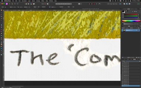
Mucking about like this reminds me of being back at work where Photoshop was a constant companion. These days I use the excellent Affinity Photo by Serif who also publish the companion programs Affinity Designer and Affinity Publisher. Admittedly the interface can be a little confusing if you’re coming from Photoshop, but with a little time and YouTube videos all becomes clear.

All are very reasonably priced too. Photo does all of what I asked of Photoshop for but at a fraction of the cost. A real biggy for me is that Serif don’t hold you to ransom with a subscription like Adobe.

I’ll composite and position my edited image onto a 10”x8” blank digital master ready for printing. And to ensure the colours and tones remain faithful to the original I’ll be arranging a test print.

When will ‘The Coming Home Trees’ be available?

Soon I hope. I’ve got to source a printer then as long as I’m happy with a test print I’ll list them in my Etsy shop. They will be 10″x8″ total size with the image life-size at around 5″x4″. They will come with a card window mount and there will be an option to have them framed.

Meanwhile, here’s a simulation to whet your appetite (final version might vary):

The Coming Home Trees Giclee print with white mount and frame (composite image)

See you soon,

Ade, 22 July 2022

Welcome (again)

Ade Turner in Damsontree Studios

Thanks for dropping by. It’s been a few years since I added new content here. These days you can catch up with me on Instagram, Facebook or Twitter. Follow me there for my latest news and paintings.

You can also visit my new(ish) Etsy shop for a selection of original paintings and prints. I’ve found it a real game changer. Some balk at Etsy’s fees, but honestly they’re not as onerous as gallery fees. Yes, it means I have to do all my own promotion but for now that’s OK.

Where’s this site content heading?

Years back when I started this site my intention was to blog regularly and occasionally review painting gear. And for a while, early on, I did just that. For a variety of reasons though that petered out. Then, during the early months of the COVID pandemic I almost shut it down completely. Glad I didn’t. Like so many people I wasn’t in the best frame of mind.

A channel like this where I’m free to expand on themes and ideas has its place. I’m not going to force it, but if I have something more ‘meaty’ to present I’ll do it here. I’ll never be a prolific blogger (or painter for that matter) but I will share when I’m ready.

Meanwhile if you’ve not been here before please explore my earlier posts. The topics bounce around a bit, but that’s just me.

My preferred medium has definitely changed

You’ll see a change in preference through the years. I used to see myself as an oil/acrylic painter. My preference now is to work fairly small in watercolour or gouache. I really love the chalky, graphic nature of gouache. So different from the free blending experience of oils. Quickly laying down opaque layers of paint to build an image feels close to magic when it comes together.

I’ll probably dip into oils now and then, but gouache is definitely becoming my ‘thing’.

What about Lino-printing?

Yes, yes, I know. Truth is, I keep putting it off. Since buying a fabulous Gunning printing press way back I’ve threatened to get into Lino printing. And I do have a long-standing project idea, but its stuck in my head. It’s currently filed under ‘how-the-heck-can-I-make-this-work’…

So there you go, a quick update on where I’m at. I hope you’ve explored and liked what you’ve seen. Do pop over to follow me on on Instagram, Facebook or Twitter, or even all three!

Ade, July 2022

Painting sets

What an interesting turn of events. Way back in October I recall saying that I was going to hibernate for the winter. Just chill and take things as they come. No plans for painting, or indeed anything else.  It sort of worked…

…but over the past three weeks or so I’ve already painted more than I did through the whole of last year. I must have been thinking about it on some level, but it didn’t seem to be a properly conscious decision.

I think it started when I watched Tiffanie Mang on Instagram making tiny study pieces in gouache, about 2.5” square if I remember right. And they were gorgeous, like little jewels. 

Small, but perfectly formed

I paint small when I’m sketching outside, but other than that I’ve never set out with the intention of making series of pure practice pieces. Sure, I’ll knock out quick pencil thumbnail sketches when I’m planning a painting, but nothing beyond that. 

So, I rummaged through my stock and fished out a big sheet of 250lb Bockingford NOT watercolour paper. I divided it into eight equal format rectangles each 14cm wide by 9cm high using masking tape.

My ground rules

I wanted to take this opportunity to practice painting fast and, hopefully, pretty loose. I want to make more use of gouache when I paint outdoors. So, I set myself these ground rules:

  • Timing: each painting session to take no longer than 1 hour (later revised down to 40mins). At the end of which time, brushes down whatever the state of the painting.
  • Gouache: I specifically wanted to concentrate on this water-based medium.
  • Big brushes: to force me to paint loose I would use only half inch flats: straight, angled and ‘vegetation’ (that’s a ragged brush, ideal for quickly generating the impression of grass and stems).
  • My usual gouache palette – Cadmium Red Pale, Alizarin Crimson, Ultramarine Blue, Indigo Blue, Cobalt Blue, Lemon Yellow and Cadmium Yellow Pale, Permanent White, Ivory Black, Yellow Ochre, and Burnt Umber.
  • From photos: these were never going to be ‘plein air’ sketches. The photos were chosen ‘at a glance’ they had to appeal to me within a couple of seconds. 
  • Absolutely no tatting! OK, so I broke this a few times…

The paintings

And here are the results. I’ve completed two sets and am about to start a third.

Gouache sketches 2019 set 1
Gouache sketches 2019 set 2

I have to say, the whole exercise has been a bit of a boost. And, the icing on the cake is that they have proved popular, with all but 2 of the first series being snapped up in a couple of days.

Here are my personal favourites so far:

Lizard Point
Lizard Point
The Coming Home Trees
St. Mary's Sunset
St. Mary’s Sunset
Creek at Gweek
Creek at Gweek
Lizard Old Lifeboat Station

The best place to follow my progress as I produce these sets is on my Facebook or Instagram accounts. A few are currently available in my Etsy shop.

Its already shaping up to be an interesting year.

Time to reflect on the good things

This year was always going to be ‘interesting’ and, as the nights draw rapidly in, I’ve been reflecting on my progress so far. You know what, in general I think it’s all been good.

While I’ve not been very prolific, I sense the quality of my paintings has definitely improved. And when I think back to the mental health issues which dragged me down over the past 3 years or so, I’ll take that as a ‘good thing’.

This year I’ve tried not to put myself under pressure to create. I’ve largely done whatever I fancied, and only when I fancied doing it. And if some things have been left hanging, the lino-printing for instance, then so be it. At the moment I’m fortunate in that this is not my prime income and I also have a ‘proper day job’ to pay the bills.

Ade Turner Artist in Cornwall
On my favourite coast path in Cornwall

So, over winter I may not paint at all now I’ve finished my latest commission. I don’t even know yet whether I’ll pick up the lino cutting either. It’s an easier option than painting as I hate to paint under artificial light, even using my wonderful OTT-Lites.

I won’t be idle of course. The new website is still on the cards but, hey, who really enjoys putting that stuff together; it might go to the back of the queue.

I will sort out those Giclee prints I mentioned last time.

And I’ve plenty of non-painty things on the boil too, including decorating (which I hate by the way…), figuring out how to use my new 8” telescope, a couple of 1/10th dinosaur sculptures which I want to prepare, modify and paint. Oh, and Red Dead Redemption II for my Xbox – it is gaming season after all, and I can see myself being lost in that for weeks.

Of everything, I’m hoping the dinosaurs  will fill my time, and fair warning I will be posting progress. At around 30” in length both are ginormous! In fact they are so big I’m not sure yet where I’ll display them once they’re sorted. Well, what can I say, they looked smaller online…

So, a quiet and hopefully relaxing winter and early New Year coming up. I will still be posting on FaceBook from time to time, so head over there and please Like my page if you want to keep up with any updates.

Someday my prints will come…

See what I did there? prints/prince?? Oh, never mind…

Anyway, prints. You will soon be able to buy high quality Giclee prints of a selection of my paintings. First off the mark will be a couple of my latest gouache paintings.

I’ve been working with Sarah at Ironbridge Fine Arts and Framing to colour match the scans of my paintings to be as close as possible to the originals. I’m very impressed! Comparing my paintings and test prints side by side it really is hard to tell at a glance which is the original. 

What is a Giclee print?

Kynance Cove: The Bellows - framed original with Giclee print
Kynance Cove: The Bellows – framed original alongside Giclee print

Giclee prints are made using top-of-the-line inkjet printers. While the technology is similar to your home deskjet printer, Giclee printers can use 12 inks rather than 4. This means they can achieve very subtle colour graduations which closely match those in the original painting. 

During printing the size of the spray droplets varies which makes for a less ‘mechanical’ finish. And the ink is archival quality so each print will have a long life with less likelihood of fading.

Once printed onto an acid-free, lightly textured watercolour paper the results are brilliant.

Which paintings will be available?

To kick things off I’ll be offering two recent gouache paintings:

  • Kynance Cove: The Bellows (featured above)
  • From Pen Olver to Lloyds Signal Station

From Pen Olver to Lloyd's Signal Station
From Pen Olver to Lloyd’s Signal Station

I will be offering both unframed without a card mount. Besides giving you the freedom to present them exactly how you want, this also means I can keep the price point affordable.

I’ll post up full details of price, size etc. once I’m ready to go, most likely mid to end of October (I have a holiday coming up very soon). 

Update: Kynance Cove – The Bellows is now available in my Etsy shop.

Going all gouache

Over the years I’ve used, and dabbled with, all manner of media. Ive tried watercolours, gouache, oils, alkyds, water soluble oils, acrylics, acrylic ‘ink’, traditional inks, silk paints, coloured pencils, charcoal, Conte crayons, graphite sticks and pencils, and pastels. And probably a few others. My art drawers are crammed full of ‘interesting’ tubes of stuff, all are slowly fading away in the darkness, some sit alone and unloved. 

What’s your medium?

If you’d asked me a few months ago “which is your medium”, I’d have said oils without hesitation.  Today I’m not so sure, because I’m beginning to think it might be actually be gouache. Maybe…

I’ve used gouache on and off for over 20 years, but not in a sustained way. A handful of small monochrome illustrations when I worked as an illustrator and more recently for occasional plein air holiday sketches. I think over time I’ve absorbed a negative notion that gouache paintings are held in low regard as a painting medium. I’ve seen them criticized because they can produce ‘chalky’ work which is over-stylised and too graphic. Not a serious medium for serious artists then…

It was only while confined to our holiday cottage on a drizzly day in June (remember drizzle…?) that I started a ‘proper’ painting in gouache. I’d deliberately left my oils at home, so it was Hobson’s choice – pure watercolour or gouache.

The painting

And here is that painting: Towards Lloyd’s Signal Station from Pen Olver’.  It’s on 450gsm Hahnemühle 50cm by 20cm NOT watercolour paper. Looking back, I was surprised how much brighter and more colourful my gouache paintings seem compared to my plein air oils. 

I roughed in a tonal underpainting using Turner acrylic gouache. Despite its name I don’t see it as a real gouache. It’s basically opaque acrylic paint suspended in a matt binder. For me it doesn’t ‘feel’ like the real deal. However, being acrylic I could paint over it without lifting any colours. 

Now I’ve gained a little more experience I’m not sure I’ll use the acrylic gouache again. I’ll probably make my underpainting direct in Winsor & Newton Designer’s gouache. They have a lovely creamy feel, are well saturated with pigment and dry to a velvety matt finish. 

However, brushstrokes must be confidently placed and then left well alone. Prodding and poking at a newly laid wash overlying a previously layer can lead to unexpected results. Sometimes this gives rise to ‘happy accidents’, but most often it results in a mucky mess. It’s this need for confident handling which determines the characteristic look of many gouache paintings – think old railway posters. 

The more I work with them, I’ve found I can make blends up to a point, but laying a thin glaze over previous layers is asking for trouble.

Conclusion?

I am still finding my way. With my latest painting, ‘Ancient Landscape’, I feel I’m pushing against the limits of layering. Some areas sport about 10.

Gouache painting: 'Ancient Landscape'. Chun Quoit, Cornwall, West Penwith, near St Just.
Ancient Landscape

On balance I think I need to try and achieve my goal in as few layers as possible, which means cultivating and maintaining spontaneity and confidence in my brush work. More practice then!

All set for watercolour

Annual holidays eh? Such a treat! For me they are increasingly a chance to get some mental breathing room to rein back my long-standing depression and let me paint for a while. Change of location I guess, away from everything. Lovely.

So, in a couple of weeks I’ll be off again to my all-time favourite destination, the Lizard Peninsular in Cornwall.

I love working plein air, usually with a pochade box, a tripod and oils or acrylics. This year however I’m leaving all that malarkey at home so I can concentrate on watercolour.

Must say I’m nervous. I’m far more comfortable painting in oils or acrylics, but on the plus side this is an opportunity to practice. And, as a bonus, the switch will make my kit considerably lighter. My back’s going to thank me for that!

Personally I’ve always found pure watercolour particularly difficult. I really love the luminosity to be had, but struggle so much to keep things clean and ‘pure’. The very act of mentally deconstructing a scene to paint from light to dark makes my brain bend like a banana in a yoga class…

But, when I work on holiday my paintings are usually only intended to be sketches for pleasure, not finished pieces. Does it really matter how I resolve an image as long as it works for me? I guess not. Big plan then: loosen up and to hell with that transparency gig. I’m taking gouache. And pastel pencils too. I can hear the purists screaming; I feel your pain.

In terms of kit, I plan to take:

  • My trusty Frank Herring Dorchester watercolour palette. I’ve tried many through the years and always come back to this one. Lightweight and with plenty of mixing room. And as I’ve had it since the early ‘90s, I guess it’s pretty robust too!
  • W&N and Holbein artists’ gouache, although I’m not too certain about the latter. Probably my lack of experience, but I find the Holbein extremely strongly tinted and difficult to handle.
  • A self-sealing palette specifically for the gouache. Not tried this one before, (pinched it from Carole…), so let’s see if it really does keep the paint moist without an unholy mixture of runny Ultramarine and Alizarin Crimson dribbling into my rucksac… Colourful, but it makes a real mess of your butties. Palette for gouache
  • A plastic rosette palette for mixing gouache – I don’t want to mix it with my watercolours, well, not off the page anyway…
  • Da Vinci sable travelling brushes 3, 6 and 10.
  • A selection of synthetic brushes for the gouache.
  • Pastel pencils. Looks like I’m taking a lot, but will edit down each day depending on what I’m doing. Pastel pencil roll
  • Various graphite and carbon pencils for sketching. There’re a few spares in there so again I’ll edit down to essentials once I arrive.
  • Masking tape (broad and narrow). I like to divide my pages, and a white border always looks so good.

As usual I’m going to keep my colour palette simple with warm and cool variants of the primaries: 2 reds, 2 blues and 2 yellows. I’ll supplement these with a few earth colours and darker variants to create denser areas of tone.

For paper I’ll be using my favourite: Saunders Waterford both in a large hard bound book (my Cornwall book) and in a few pads.

Cornish sketchbook

I’ll also take my Stillman and Birn sketch pad and a Moleskine watercolour journal for ‘light’ days.

And that’s it. Hopefully, Wi-Fi willing, I’ll be able to post more when I get down there. In the meantime remember I’m often more active on my Facebook, Instagram and Twitter accounts so please check me out there too.

Cornwall in September

I always look forward to my visits to Cornwall, it really feels like a second home now. This time we’re celebrating my wife’s ‘big’ birthday, so we’re here for three whole weeks. We’re about to go into our third week.

It’s not meant to be a painting holiday, but I’ve brought my plein air kit anyway! Oils this time rather than my usual acrylics.

To be honest, since we arrived on the Lizard Peninsular from our first week on the Isles of Scilly the weather hasn’t been exactly clement. A succession of storms have passed through, including a spectacular one at three in the morning which was more than biblical in proportion. Thunder and lightning accompanied by the most severe torrential rain I can recall seeing. Not good.

So in between relaxing as a family and dodging the weather, times to set up and concentrate on painting have been relatively few. I have sketched a little, but not very much.

The paintings

Here are my three 8” by 10” efforts in oils to date. The first is a view from our cottage garden.  I’ve moved a few things round, but I’m still not that happy with the composition. The second is in one of my favourite spots on the Lizard, Poltesco a long abandoned serpentine works. And the third is a roundhouse from the 16th century on the road to Church Cove.

It’s been very restful using oils again. So much more time to think about colour mixes. Acrylics are very unforgiving. Turn your back and they turn into an immovable solid lump of plastic on the palette and brush. It’s nice to be able to take the generous time which oils allow.

Hopefully I’ll get a chance paint some more in the last week of our holiday. If I can, great, if not, oh well, the holiday comes first.

Remember, my FaceBook page is often updated first with snippets and odds and ends.

Of pets and sketches and being unbusy

With my studio still stuffed full with boxes of stuff from my late Dad’s estate, apart from making occasional sketches I’ve not been at all productive over the past 18 months. I completely underestimated the sheer physical amount of personal material I’d have to pick through and the ongoing, negative emotional impact that would have.  In truth, I’ve had neither the time nor inclination to get stuck into anything very much.

A new pet portrait commission…

Before I completely filled the studio, early in the year I started a new commission in alkyds, a pet portrait of a gorgeous Italian Spinone dog. As I needed to work from photos I’ve found my iPadPro remarkably useful, being able to zoom in and adjust the lighting to reveal structural detail at will.

At the moment this is on hold with my client’s blessing, but it is close to completion. Unfortunately at 70cm by 100cm it is rather large, and I’ll only be able to finish it once my studio’s clear again.

…and a Cornish break

At least my June holiday gave me time to settle and sketch. Here are a few 6″ by 8″ acrylic sketches from my visit to the Lizard peninsular in Cornwall.

And I’m off again in September. First to the Isles of Scilly for 1 week and then the lizard again for 2 weeks. A three week holiday! I won’t want to come back! My plein air kit will go with me of course.

I’m still undecided whether to take oils instead of my usual acrylics. So many advantages including extended drying time and retention of brush strokes. But after a few trial runs in the garden I really need to brush up. I seem to be very good at making panels of mud!

With things as they are at the moment it’s a lot less of a faff for me to upload a post to Facebook and Instagram than this blog as I can easily do it on the fly from my phone. So, i
f you’d like to see more frequent updates, please head on over and like my FaceBook page. 

Oil paints are calling again…

Well, here we are on Christmas Eve. You know, it really doesn’t feel like two months have gone by since my last post. These long gaps are getting to be a bit of a habit. I was really on a high when I returned, but once the initial post-holiday buzz wore off and the nights drew in everything’s become, well, bloody depressing again if I’m honest.

That said, I have made a start on my ‘View to Charmouth’ seascape. And one thing I discovered is how much I’ve missed working with oil paints (well, alkyds). Two things above all have struck a chord. First the texture, lovely and buttery with every brush mark preserved. So nice to push it around safe in the knowledge that the brush isn’t going to immediately congeal into an unforgiving, insoluble lump. I do like acrylics but…

Second, and I know it’s not a good thing to be breathing it in, I do so love the smell of turps! They reckon smells are strongly linked to memories and that’s what I’m finding. The warm and heavy resin scent takes me back to when Mum and Dad bought my first set of oil paints when I was about 11; a Christmas present I think. It made me feel dead grown up – a real oil painting set, just like what ‘proper’ artists use! I was really made up, and somewhere my first efforts are still waiting to be discovered round at Dad’s house.

Of course I had absolutely no idea how to use them. My only painting experience was with the hard, gritty slabs of school poster paint. So, I used lots and lots of turps to thin them to within an inch of their life; nice and sloppy. And then I’d mix them; all of them. Whatever I mixed, it usually came out as a bluey shade of brown. Well, I was only 11. Any understanding of colour and tone was still a far distant star… But it was such a joyful experience rubbing my ridiculously dribbly oil paints over tiny rectangles of oil paper. Without the gift of that experience and Mum’s constant encouragement, “never let your painting go”, I probably wouldn’t be painting now.

So I set out an 80cm by 20cm canvas, squared up the drawing and thinly washed in the keynotes before working over in thicker paint.

View to Charmouth gridded up

View to Charmouth underpainting

At this end of the year I tend only work at weekends when I can make use of the daylight. I have some very good Ottlite daylight lamps, which I find great for small scale work, but I don’t find them comfortable for sustained working over a largisih painting.

View to Charmouth underpainting 2View to Charmouth 5

So now the winter weather has turned day into fifty shades of grim and gloomy grey, I’ve stopped painting for the moment.

Fingers crossed though, over the Christmas break, I’m hoping we might get some clear bright weather so I can tinker once more. In the meantime here’s hoping you and yours have a lovely Christmas and a Happy New Year.

See you all on the other side!