For all my apprehension at creating a portrait of one of my colleagues, Ben, in a series of short, live and public sittings I have to say I’m really enjoying myself.
Frankly there was always much which might have conspired to derail the process. Not least I expected my decision to try and paint at my workplace to raise a few quizzical eyebrows. From the point of view of our facilities management team mine must have counted as one of the oddest requests they’ve received. And I’d no idea what my managers and colleagues might think…
I have to say that so far my efforts have been met with nothing but interest, and I’ve had some very lovely comments from all quarters. So far, so good. Everyone has been so gracious and accepting of this lunatic who brought his paints and easel to work. Far from being off putting, I’ve found the attention has been very encouraging, spurring me on to give of my best.
Even switching rapidly from my ‘work’ head to my ‘painting’ head hasn’t been as problematic as I thought it might. The shortness of time available to me during breaks is forcing me to make rapid decisions and I’m making sure that every minute available for painting counts.
Under-painting complete in 40 mins
Our first session was about 40 minutes of painting time (I’m not including any prep and clean up time). I wanted to complete a tonal under-painting as quickly as possible so over an initial red chalk drawing I used a 1″ brush and Burnt Umber darkened with Mars Black or lightened with Titanium White. Ben sat against a neutral coloured blind with a very strong, sunlit, backlight shining through.
Background under-painting
The second session was completed in 20 minutes without Ben present. I wanted to establish the under-painting for the background. I chose to work this in a pale violet to act as a compliment for what is likely to be a cool yellow ochre final colour.
Broad colour applied
Then, darkness… On the third session the clouds and rain rolled in, and the wonderful light we once had was sucked into a growing grey grimness. With a yellowy artificial light coming from many directions, I relied on both observation and memory to inform where I should lay the first colour blocks. I’ve mostly used Liquitex Heavy Body acrylics supplemented with a few Winsor and Newton Artists acrylics. For speed I worked with colour straight from the tube without any added medium other than a wee spot of plain water to increase fluidity.
I particularly relish the cool mixes arising from the cobalt blue and yellow ochre. Lighter tints were made by adding a combination of Mixing White and Titanium White. Titanium White on its own can be very harsh, I like the softer effect of adding Mixing White. A single half inch flat brush was used throughout.
While progress on this session was rapid, about 25 to 30 minutes, I can already see I’m actively avoiding three areas: the eyes, mouth and nose. Got to get a grip on these next time while also working more broadly across the rest of the painting. More sessions are planned for next week when I’ll try and bring the weaker areas up to scratch. Watch this space.
First of all ‘Thanks’ to everyone who visited ‘Closer to the Art’ last Saturday in Stone, Staffordshire and came up to say ‘Hi’. So many lovely people and a great atmosphere, with four of my fourteen paintings finding new homes with a positive option on a fifth. I’ll be honest, I thought my lowest priced paintings would have been the first to go; shows what I know doesn’t it?
Oddly, even for such a modest show, I found fitting the preparation in between work and home unexpectedly tiring; I’ve been a positively bleary eyed this week – and a little listless too. So, now that ‘Closer to the Art’ is out of the way, I think a change of pace is in order.
I’ve decided I’m going to do two things. In the evenings I’m going to set about my Hulk vs Spider-man sculpture again. Bit of a long running fan-boy project this which seems to emerge when the nights get darker (its been safely tucked up in a cosy box over the summer). I find this sort of sculpt proceeds very slowly, so don’t expect any major new reveals immediately. More over the coming weeks.
During the daylight hours, when I’ve got more chance of actually being awake, I’m going to take part in the #PortraitNovember Twitter challenge. For this I’m going to build on the work I did during #DrawingAugust where I produced pen portraits of my work colleagues every day for the whole month.
Day 21Day 1
One of my colleagues (pictured) has very kindly (foolishly?) offered to sit for me throughout #PortraitNovember. This time I want to use acrylics, and work larger than my original sketches. I’m hoping to paint during break times at work, and my employer has kindly given permission for me to set up easel and paints in our offices for the month. Guess I know who’ll be providing the lunchtime entertainment over the next few weeks…
My intention is to make only a quick preparatory sketch, then get straight into making a single painting. In reality I’m only going to be able to spare a couple of hours a week at most.
I’m not at all sure how well this is going to go. During #DrawingAugust the thing I found most challenging was snapping out of my analytical ‘work’ mind-set and straight into a creative state of mind. Some days were very obviously better than others! Combine that with the fact that portraiture in general is so far out of my comfort zone, this could prove interesting. Watch this space.
After what seems to have been a long run up, yesterday, October 25th, finally marked the arrival of the Closer to the Art exhibition and fair in Stone, Staffordshire. It was the second such exhibition organised by renowned dragon sculptor Andy Bill.
I’m no stranger to craft and country fairs. A long time ago in a previous life I both organised the former and represented my employer at the latter. So I already had a good idea how much work was involved.
Our stand (photo courtesy of Noel Bennett)
However, this was the first exhibition where I’ve represented myself, and the butterflies were fluttering in abundance in the hour or so before the doors opened. Together with Carole, my wife, we set up on two tables right next to the main entrance.
Carole’s first saleFuschia beaded needlecase by Carole Turner
Once the doors opened the show became very busy, very quickly; there was lots of local support. I had no real expectation of whether or not we would make any sales, but by the end of the show Carole had sold a needlecraft brooch and a beautiful beaded needlecase, and I sold three paintings, all of local landscapes.
Stone Boatyard 10″ by 10″ Acrylic on wooden panelRain over the Staffordshire Moorlands
Narrowboat by Joules’ Brewery
All told it was an enjoyable and successful day. Would we do it again? We’d certainly consider it. I think we both learned a lot, although I might take a slightly different tack next time. I’d definitely consider offering more paintings with local interest, and possibly back them up with prints and cards to appeal to all pockets. Buying an original painting at a fairly small show doesn’t really strike me as an impulse buy.
And now it’s all over, I think I’m going to chill for a bit – it’s all been a bit intense. Besides something I have in mind for the Twitter challenge #portraitnovember, I’m going to revisit my Spider-man and Hulk sculpture as a bit of light relief. Heck, it’s about time I finished it…
Time seems to have gone by so quickly this year. It’s now only just over a week until the Closer to the Art show at Stone Railway Station in Stone, Staffordshire on 25th October. Around ten artists from various disciplines will be exhibiting including sculpture painting, illustration, photography and ceramics. A great opportunity to pick up a unique Christmas gift.
Ade Turner – Closer to the Art
And over the past weeks I’ve been busy painting, framing and generally getting everything ready. That’s me over there, posing for a publicity photo and frankly feeling a little uncomfortable – physically and psychologically! My wife too has been working on some beading and needlecrafts, but more of those in a future post.
This is my first show as an exhibitor, so with no previous experience to fall back on I’m going to be relying on educated guesswork. How much packing do I need? How do I display the work to best advantage? What is the worst thing I could forget to take on the day?
It’s all very exciting, and as with anything new, just a little scary too.
Well, after a wobbly start I think I’m starting to settle back into painting en plein air. I really am out of practice.
With me, much depends on being in the right frame of mind. So I took the opportunity to go AWOL and snuck off painting this evening. It was calm, warm and overcast, and I walked down to Church Cove to set up on the wee spit of land overlooking the inlet.
I was determined to work more loosely today and I gave myself an hour limit. I’ve found that having a limited time focusses the mind and, for me, drives better results. I also resolved to use only a couple of flat brushes, 1.5cm and 1cm (ignore the fan in the photo, I didn’t use it).
Once I’d set up my pochade box I laid out my basic acrylic palette:
Titanium White
Mixing White
Ultramarine Blue
Cobalt Blue
Yellow Light Hansa
Quinacridone Red
Permanent Alizarin Crimson
In addition I added a couple of cooler blues and three earth colours:
Cerulean Blue
Indanthrene Blue
Yellow Ochre
Raw Umber
Burnt Umber
Plein air pochade Church Cove
On my 20cm by 30cm linen covered mdf panel from Jacksons I drew out the basic shapes and quickly blocked in all the features roughly before more carefully noting the passages of light and dark.
As usual I kept the acrylics open by occasionally spraying the palette with water – not too much though, I didn’t want to make colourful puddles!
Plein air acrylic sketch – evening mist at Church Cove
I’m pretty pleased with the result, but what do you think? Why not leave me a message?
Well we’ve now been on the Lizard Peninsular in Cornwall since Saturday, and as usual, it’s great to be here. This really is a special place.
Sure, the area around the Point itself can be busy during the day. However my experience is that the visitors generally stay fairly localised, preferring to drive up, park, peer, visit the café then depart leaving the wider area relatively quiet. And from around 5:00pm everywhere becomes still. Suits me down to the ground.
I have to keep reminding myself that this is first and foremost a family holiday and not purely a painting trip, otherwise left to my own devices I’d keep sneaking off…
That said I have had some opportunities to paint en plein air. Have to say though I’m feeling very out of practice, and the results have been mixed.
Over Housel Bay
This is a quick watercolour from Sunday overlooking Housel Bay from rocks near Bass Point. The light was striking, fleeting sunlit patches over the cliffs, but not sure I’ve captured it here.
Ade Turner painting en plein air
Today I dragged out my pochade box stuffed with acrylics and wandered down to Church Cove. I really do like the Mabef system. It provides a solid work platform, and it’s usually a comfortable platform too unless you set it too high as I did (see photo) – oopsy. I know I could’ve adjusted the height easily enough but heck, I’m not that bright!
Towards Kennack Sands from Church Cove
I’d prepared a panoramic board as I wanted to take in the wider view down the coast east of Church Cove looking towards Kennack Sands. The light was very flat today and I had difficulty from the get go determining tone and depth.
Any confidence I originally felt when I set up sort of melted away. Still, I laid it out and pressed on. And by midway it was not going well at all. In truth I almost had a ‘Fast Show’ moment when I developed a steely determination to pitch it over the cliff – but I resisted.
I often find I’ll hit a low point mid-way through almost every painting. There’s frequently a disjuncture between what I see, what’s in my head and what’s actually coming out of my brush. In this case I think I turned it around sufficiently for me to want to complete it at a later date. But for now it’s going into a box for a while.
Let’s see what opportunities the rest of the week brings.
I’ve always had great admiration for those hardy artists who devote much of their painting practice to en plein air (basically painting outdoors). Whether sun, rain, hail, wind, sleet or snow they’re ‘out there’ weaving magic with their brushes. The impressionistic freshness and vitality borne of being in front of the subject always shines through.
I love working outside, but it’s been mostly reserved for holiday forays when I’ve got time to get into it, far away from life’s distractions. Oh, and it’s always in fine weather. I know, I know – it hardly seems in the spirit of things, but what can I say? I likes me comfort…
Even being a fair weather painter isn’t without it’s challenges. I find bright sunlight is troublesome, and not just because of the sunburn. When such a strong light falls on the palette and painting, I find judging tones accurately becomes difficult. I often end up with a painting that turns out darker than intended – looks fine outside, but a bit murky when it’s back indoors. Working from natural shade is the obvious solution, and where it doesn’t exist, a white umbrella. Unfortunately I’ve still not found an umbrella which suits. Frankly, clamping one directly to an easel or pochade box doesn’t seem a sound solution when wind is involved and a ground spike is less than useless on hard rock.
Oddly, one of the biggest pitfalls I find when working en plein air is psychological. I may have the potential to paint well, but once set up outside it’s like my ability slinks off and hides somewhere dark. My response is to start rushing and make basic errors; I can feel very pressured.
Because I want to expand my plein air work, I’m making deliberate efforts to slow down, to take my time to really get a feel for the subject before randomly pitching in. As for being ‘on show’ or providing the ‘entertainment’ I have to say that I’ve only ever encountered kind comments and genuine interest from onlookers. Any fear of negative encounters is entirely in my head, and I shall be rid of it.
All tooled up
I guess everyone who works outside takes a while to evolve the ideal mix of kit to suit their style. As I work in watercolours and acrylics I have developed solutions for both which work best for me. There’s nothing revolutionary here, but I hope you’ll find this run down useful.
For wobbly watercolours…
Watercolours have always been one of the simplest and most mobile options. I’ve got my kit down to a tee now:
At its heart is the wonderful Herring Compact Palette. I must have had mine for close on twenty years now. It’s the full pan version with a dozen W&N colours. It lies very nicely balanced in the hand and has very generous mixing wells. Excellent. Over the years I’ve collected all manner of kits and boxes, some really lovely like the teeny-tiny W&N enamelled Bijou box, but I always come back to the Herring. Perfectly practical and practically perfect.
I carry three sable travel brushes. A 10 and a 6 Da Vinci, and a 4 from an unknown manufacturer. I did try a travel sable from Rosemary’s, but was disappointed. The handmade brush itself, an 8 or 10, was very nice but the metal tube handle into which it was set was woefully narrow. Inevitably the brush became damaged beyond repair. The Da Vinci brushes are well made and screw back into generous tough plastic handles scaled to suit the size of the brush.
A tube of Schminke masking fluid.
Masking tape for dividing pages in my largest pad.
Rubber bands to stop pages lifting in the wind.
A Sainsbury’s yoghurt drink bottle for water and a small plastic cup (from an M&S pan-a-cotta).
A range of hardback pads. I usually make sure I have three sizes available back at ‘base’ to give me options when it comes to lugging them around. Inevitably I use heavy-weight Saunders Waterford Not; by far my favourite paper. It’s robust, stable and very tough and forgiving, and I love it.
Most times I’ll squish most of the above into a very small shoulder pack from the National Trust, but occasionally I’ll use a larger day sac to accommodate one of the larger pads.
…and awkward acrylics
Having used both oils and alkyds outside, last autumn I switched to acrylics. To be honest I’m having a love-hate relationship with them. I love their versatility, easy clean up and oil-like qualities, but I hate their alarmingly short drying time. Turn your back and they set in minutes.
While indoors their open time can be fairly generous, this shrinks drastically on a hot sunny day with a light breeze. I’ve tried slow dry medium, and a stay wet palette (the small Mastersons offering) but now prefer to carry a small spray bottle of water to keep the palette workable. Just a light spray on the palette every now and then keeps everything mobile.
The stay wet palette did work very well, but as I wanted to save unused paint for the next day’s painting I found I had to be careful to carry it horizontally to prevent the paint slumping together and dribbling out through the closed lid – no fun when walking over miles of cliffs.
I like to work on panels and the solution which best suits me is to carry them in a pochade box. So handy: an easel, wet painting carrier and paint box all in one. Downside? They can be heavy and bulky.
The Herring Versatile Easel
Sometimes if I fancy working on a larger panel I will bung all my paints into a rucksack and take out my Herring Versatile Easel. This lovely bit of kit is so light at 4.5lbs but remarkably stable. And it lives up to it’s name. There are so many configurations when setting up it will cover most eventualities. I also have one of their earlier incarnations which has a box attached, but the mechanisms are less robust and don’t lock. It was a great easel, but this new version trounces it.
Worth the weight
When walking any distance weight is everything. I found this to my cost when I insisted on taking my french easel down to Cornwall. Don’t get me wrong, it was a brilliant work platform, but at around 16lbs when empty the novelty soon wore off after trudging a couple of miles!
A plethora of perky pochades
Here’s a selection of the boxes I’ve accumulated. They have all been used, honest – I’m just a very ‘neat Nigel’ by nature. From top to bottom there lurks that portly french easel. Then, to the left, my 12.5″ by 16″ Mabef. To the right is a nice handmade box by William Dorsett. The next is a 10″ by 8″ I made myself around twenty years ago. Finally, in the front, a small box for 7″ by 5″ panels (although no commercial boards actually seem to fit without trimming – really annoying).
Hmm, looking at that lot, maybe I have a bit of an addiction to pochade boxes and might need intervention… Good job I didn’t carry through with my obsession for this cabinet-made American beauty: the Alla Prima Pochade. I was sooo tempted, but ultimately it was a little too rich for my pocket. That and the fact that Ben Haggett, their maker, no longer ships to the UK because of many instances of in-transit damage caused, it’s thought, by HM Customs. Shame.
So, my current favourite is the Mabef pochade, which weighs in at 10.5lbs when full. At the time of writing Jacksons have an offer on this same model as part of their plein air month promotion. I can really recommend it.
I love its flexibility and in particular I like the simple clips which firmly hold the panel either portrait or landscape. They can be moved to accommodate a range of panel sizes too. Far better than the usual set grooves which hold panels on three sides and hamper edge to edge painting.
Addition to Mabef pochade
The box arrived with a custom modification courtesy of my wife – an additional grooved wooden spacer. This now allows me to safely store smaller panels too.
It has a great capacity for paint and brushes. When using it with acrylics I fasten drawing board clips covered in Velcro to the palette where they grip a plastic water pot similarly furnished with Velcro – prevents messy accidents!
Mabef pochade stuffed with acrylics
In common with other larger boxes this one can be mounted onto a tripod. Originally I pressed my camera tripod into use, but at 7.5lb it is rather heavy. So I recently bought Mabef’s own wooden tripod from Jackson’s. At around 3.5lbs it’s lots lighter and with a wider top plate it’s far more stable too, reducing the pressure on the tapped bush. To make it even more portable I attached a brass loop so I can attach a carry strap if I need it. Although using an existing camera tripod is tempting, I’d advise getting one of these. As a sneaky bonus I’ve found it’s also compatible with my telescope, so that’s the dolphin/bird watching taken care of.
Mabef easel tripod
And finally…
As to additional kit, there’s always the need to dress appropriately for the weather. Even on fine days I’ve been caught out by surprisingly uncomfortable chilly breezes. For the baking sun I’ve usually got a long sleeved shirt, sun cream and a daft hat to hand.
Depending on where I’m going I may take a rucksack containing water, wipes, kitchen towel, food and drink etc. and to bring ease to my grinding knees, a comfy seat too.
I think working en plein air qualifies as a ‘Marmite’ activity, you’ll either love it or hate it, I’m not sure there’s an intermediate state. If you haven’t already done so why not get out there and give it a go. It’s an experience well worth the effort.
Since starting my Sir Gawain series, things have slowed a little. Other things have either needed attention (real life things) or wanted attention (fun things which have distracted me). OK, more of the latter if I’m honest… However, I have continued work on a related, but separate, acrylic painting by way of a ‘dry run’ based on this quick sketch:
Gawain’s wildwood journey
I’m becoming more familiar with acrylics now. Following some rubbish acrylic experiences several years ago, (most down to operator error and poor quality pigments), they’ve only recently found a proper place in my tool kit.
And I’m finding their properties better suit my temperament (ever impatient…) that I’m starting to use them as a default where once I’d have picked up alkyds or oils. I can work quickly, and their fast drying means I can apply repeated glazes in a single sitting. The bonus too is that they clean up easily without solvents.
There are downsides though. A lot of paint gets wasted as it inevitably cures on the palette, and I’m finding fine blending is trickier than when using oils. I’ve tried the slow-dry gels, but for me the paint texture seems to become oddly ‘tacky’.
Originally I started using Winsor and Newton Artists acrylics, but after making comparisons with Liquitex Heavy Body acrylics I think I may switch to Liquitex for most colours. They’re generally more economical and in my opinion compare favourably with the W&N offering in terms of viscosity, texture, ‘open’ time and stability of colour/tonal shift from wet to dry.
So here’s another ‘in-progress’ shot. There’s a long way to go, and the photo really doesn’t reproduce any of the subtle colour shifts going on in the shadows (click a couple of times to enlarge):
Sir Gawain’s wildwood journey progress
The eponymous Sir Gawain is nowhere in sight, but that’s OK, but the inspiration from the poem is in there.
I’ve introduced a warmer sky to increase both the tonal and temperature contrast when compared to the deep, dark, cool shadows. The gold and red also mirrors the colours associated with Gawain.
The wild-wood setting echoes the bleakness of his journey while the fox, so slyly skulking in the seeping shadows, foretells of Gawain’s deception later in the story.
I hope I’ve started to capture an underlying feeling of unease here, but what do you think?
Well, the wooden panels for my Sir Gawain and the Green Knight series came from Jacksons the other day, and very nice they are too. Smooth, well framed and surprisingly light for their size. I’m now the proud owner of two 12″ square and four 12″ by 16″.
But before I crack on and get smothered in acrylic gesso, I’m painting a related 18″ by 24″ canvas in acrylics as a trial to inform my approach to the main panels. At the moment it’s all still too tight and pernickety – the small study on the left is closer to the feeling I want to get.
Sir Gawain’s wildwood journeyStudy for Gawain’s wildwood journey
Rubbish photo by the way – I’ll post a better one at some point when I can actually get to see it in daylight.
There’s a long way to go yet. See that cunning fox? Well it won’t be so easy to spot once I’m done with it.
Sir Gawain journey end panelSir Gawain journey start panel
I have made a start on rough sketches for the two 12″ by 12″ end panels representing the start and end point of Sir Gawain’s journey to the Green Chapel. These will be linked by three or four 12″ by 16″ panels. The intention is that each panel should both work on its own and together as part of a greater whole.
Sir Gawain’s journey is not a comfortable one, and I thought that my painting journey should likewise take me out of my comfort zone. Not into flesh-flensing, tooth and claw battles with wolves and woodwoses you understand; no, I was thinking more stylistically (besides, all that fighting malarkey sounds far too much like hard work!)
I have considered a few options, and the panels would really lend themselves to a stylised narrative aesthetic as seen in paintings by Dee Nickerson and Sarah Birdie Fincham. I really love the work of these excellent artists and find both sublime, but sadly I don’t think I yet have the sensibility to work in a similar manner.
Recently I came across the multi-media work of Lisa Henderson. Her rich landscapes are gorgeous, and I could see a similar treatment working really well with Sir Gawain’s journey. You can currently see her exhibition ‘Staffordshire Landscapes, a personal view’ at the Shire Hall Gallery in Stafford until 9th March.
Despite these tempting options I continue to be drawn to a heavily textured expressive approach bordering on the abstract. Kurt Jackson’s work has always been a great inspiration to me – he squeezes so much soul into his sea and landscapes. They’re achingly beautiful, and the style’s far enough out of my comfort zone to make me sweat, so maybe I’ll head down that route, maybe…
Ah well, not all my ideas work well the first time round. For my main Sir Gawain cycle of paintings I’d always intended to knock up a rough, small-scale test piece to see how the colours might flow through from one panel to the next.
In my mind I see a subtle underlying chromatic progression from Sir Gawain in the red corner (his shield is scarlet) to the Green Knight in the green. So on a piece of A3 Cryla paper I roughly under-painted in acrylics with Viridian on the left running into Alizarin Crimson on the right. Over these I used diluted Mars Black to create darker bands of tone.
Working with the Viridian as an underlay for Sir Gawain’s side (as a compliment to his scarlet shield and gold apparel), I roughed in three rough bands in colours roughly approximating to the seasons – spring on the left, winter to the right.
On top of these I wanted to super-impose my scale panels but realised I hadn’t made a decision how big they should be.
Now, in the part of my mind that wanders off and gets very excited very quickly I’d always had a vision of a row of enormous panoramic panels, mounded with crusted, heavily textured paint… unfortunately the duller more down to earth bit woke up and chipped in with all sorts of practical reasons why I couldn’t actually do that; spoilsport!
Truth is I haven’t got a huge studio space where I can lay everything out at that scale, let alone work on it. I was also concerned that it might be so large that I might not actually finish it! And if I did finish it I wouldn’t have enough wall space to display a mammoth work either. You can tell I’ve really thought this through…
So begrudgingly, like a toddler being denied a huge ice-cream, I pouted, shuffled and scuffed my feet and mentally shouted ‘not fair!’ and set about scaling my ambition down to do-able proportions.
I reckon two 12″ by 12″ end panels and three or four (still not decided) central panels 12″ by 16″. As wooden panels have an appropriate resonance I’ll soon be pinging an order to the good folks at Jacksons.
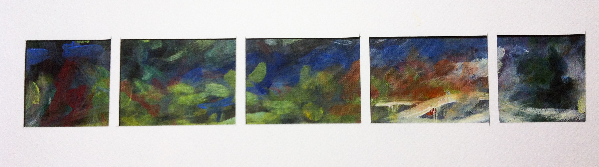
With the size settled, I cut a mask out of stiff white paper to a scale of 4mm to 1inch, like a row of little windows to represent the panels in their final order. This I overlaid onto my rough colour test. By trying different positions I came up with these:
To be honest, a little disappointing and underwhelming. Although the second holds a certain obscure promise I really need to go back to the drawing board. The tones are too similar and the colours don’t carry the variety I’d like.
I suppose if everything always worked first time we’d never learn anything would we?


